House Graphics
- Download Info
-


- Author(s): Dinkme
- Categories: Development, Graphics
- Downloads: 23
- Main
- Reviews
- Versions
- Screenshots
- File Discussion
- Contribute
- Add a Screenshot
- Write a Review


This pack consists of 27 sprite graphics, and 1 tileset. The sprite graphics are 20 houses, two doors, a teapot (wtf?), a pillar (I guess), a globe and two trees. The tileset is a modified version of Mike Snyders famous ts39.
There are a few pluspoints, and a lot of critique to give to these houses. I'll start with the critique so we'll end with the positive stuff.
Critique:
- The houses look like plain, textured cubes. Some more creativity would be really nice.
- The angle of the houses isn't the same as the angle of the doors. This is true for at least half of the houses.
- They don't have shadows! Really, this is a big downside.
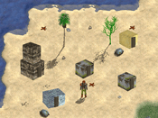
- The use of the textures. The top-texture is really only a side-texture, but rotated. This is best seen with the metallic-style house-15 and house-16. These are in the screenshot on the lower-right and in the middle.
- The tileset. Tilesets are only usable if they're 640*480 or smaller, this one is 1121*1024 and it looks like there's some part missing.
Positive stuff:
+ Nice textures.
+ I liked the trees. Especially the palm-style tree (house-26).
+ Indoor items are also really good, though I wonder why one would need a teapot. It's a nice teapot nonetheless.
I can't remember how the previous version(s) looked like, so I don't know if these are better or worse.
In short: I don't recommend this graphics pack for the houses. The trees, teapot and globe are nice, though.
There are a few pluspoints, and a lot of critique to give to these houses. I'll start with the critique so we'll end with the positive stuff.
Critique:
- The houses look like plain, textured cubes. Some more creativity would be really nice.
- The angle of the houses isn't the same as the angle of the doors. This is true for at least half of the houses.
- They don't have shadows! Really, this is a big downside.
- The use of the textures. The top-texture is really only a side-texture, but rotated. This is best seen with the metallic-style house-15 and house-16. These are in the screenshot on the lower-right and in the middle.
- The tileset. Tilesets are only usable if they're 640*480 or smaller, this one is 1121*1024 and it looks like there's some part missing.
Positive stuff:
+ Nice textures.
+ I liked the trees. Especially the palm-style tree (house-26).
+ Indoor items are also really good, though I wonder why one would need a teapot. It's a nice teapot nonetheless.
I can't remember how the previous version(s) looked like, so I don't know if these are better or worse.
In short: I don't recommend this graphics pack for the houses. The trees, teapot and globe are nice, though.


Good: ok! Some nice simple houses that look good in any type of land whether it is grass or desert. Dinkini line gas been included so it becomes easier to put it in a DMod. Newer version is a bit to mordern.
Bad: The edges are a bit odd but I will improve it.
Score:4.1
Bad: The edges are a bit odd but I will improve it.
Score:4.1


While I appreciate the effort Dinkme undoubtly has put into crafting these very bland house sprites, they just don't look right.
I have to admit, the updated graphics are a lot better than the old ones, but they're still not very good.
First of all they are really misplaced in the Dink Universe. They might be useable for a 21st century kinda game, but the walls of the houses look way too modern for Dink.
Also, the sprites are rendered poorly, and there isn't much detail to be found here.
On the good side, there are a lot of different perspectives and some smaller sprites along with the usual sprites. So if you do want to use them, you have plenty of choice.
In conclusion, I'd say, Dinkme, don't give up! These graphics are a big improvement over the old ones, and I strongly believe that practice makes perfect. Keep improving, and someday we might have a Simon 2 right here at the DN. For now, it's just very mediocre.
3.5


I think the updated house files look better.
I like the stone/brick look.I didn't like the
doors at all though.
I think some variation in color might be nice.
Maybe the roofs should be something other than
the same material as the walls.
And different doors for sure.
I like the stone/brick look.I didn't like the
doors at all though.
I think some variation in color might be nice.
Maybe the roofs should be something other than
the same material as the walls.
And different doors for sure.


Not very useable graphics these. Extremely basic, and not really worth the download. They certainly wouldn't get into a d-mod ahead of the default houses.


