Tullisti's First Graphics Pack
- Download Info
-


- Author(s): Tullisti
- Categories: Development, Graphics
- Downloads: 55
- Main
- Reviews
- Versions
- Screenshots
- File Discussion
- Contribute
- Add a Screenshot
- Write a Review


Hmmm, Tullisti's first graphics pack, let's have a look...
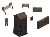
First thing I thought when looking at these graphics, was that they all look quite detailed, and totally different than Dink. Dink has more of unrealistic style, but these graphics look very realistic. I like that.
Some graphics look extremely good, like the guardhouses and wells.
The stone walls look also very good, and the tables are nice too. Although I don't like the ugly outdoor table, it has bad color.
And the fences... hmm... well the fences look pretty good, but not as a replacement for Dink's. They're too big, and.. just don't look like a normal fence that would be placed in nature (like in Dink). They look nice though.
So, overall quality of the graphics is very good, and since this is a graphic pack, there's nothing wrong, right?
Wrong. The graphics look good, yeah, but there are all kinds of weird yellow pixels around the models. Especially the fences and tables had a lot of these white and yellow dots around them. Also some wells looked very weird, very vague.. Most graphics look kinda crappy in Dink, because of the errors, so the only thing to do is to modify them yourself.
It took me over an hour to get them right, and believe me, it was a boring job! This obviously decreases the final score.
Also, there are some other stuff, like blender models or so, but since I don't have blender, I have no use for them. Too bad for me I guess...
I would have given this pack a 9, but because of all those little errors, I'm taking 1 point from the score.
TOTAL: 8.0
A graphics pack with quite some high quality graphics, though with many little errors which you have to filter away yourself


