Reply to Re: Status Bar Critique Wanted
If you don't have an account, just leave the password field blank.
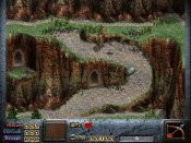
Everything doesn't fit together that much. The attack, defense and magic texts don't look like they belong in the stony theme, the side bars don't connect to the down bar (there's also a bit of empty space between them and the edge of the screen), and it would be neat if the health bar was somehow stonier, too.
It's not half bad, though, the weapon and magic slots and the experience bar look good, it could be great with a little bit of adjustment.
It's not half bad, though, the weapon and magic slots and the experience bar look good, it could be great with a little bit of adjustment.


